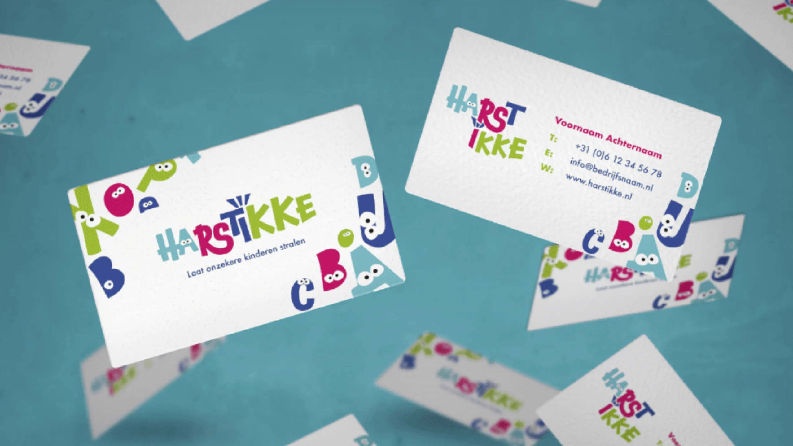
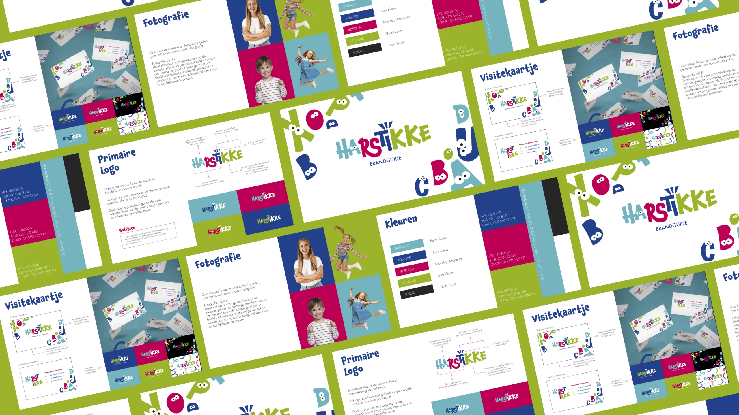
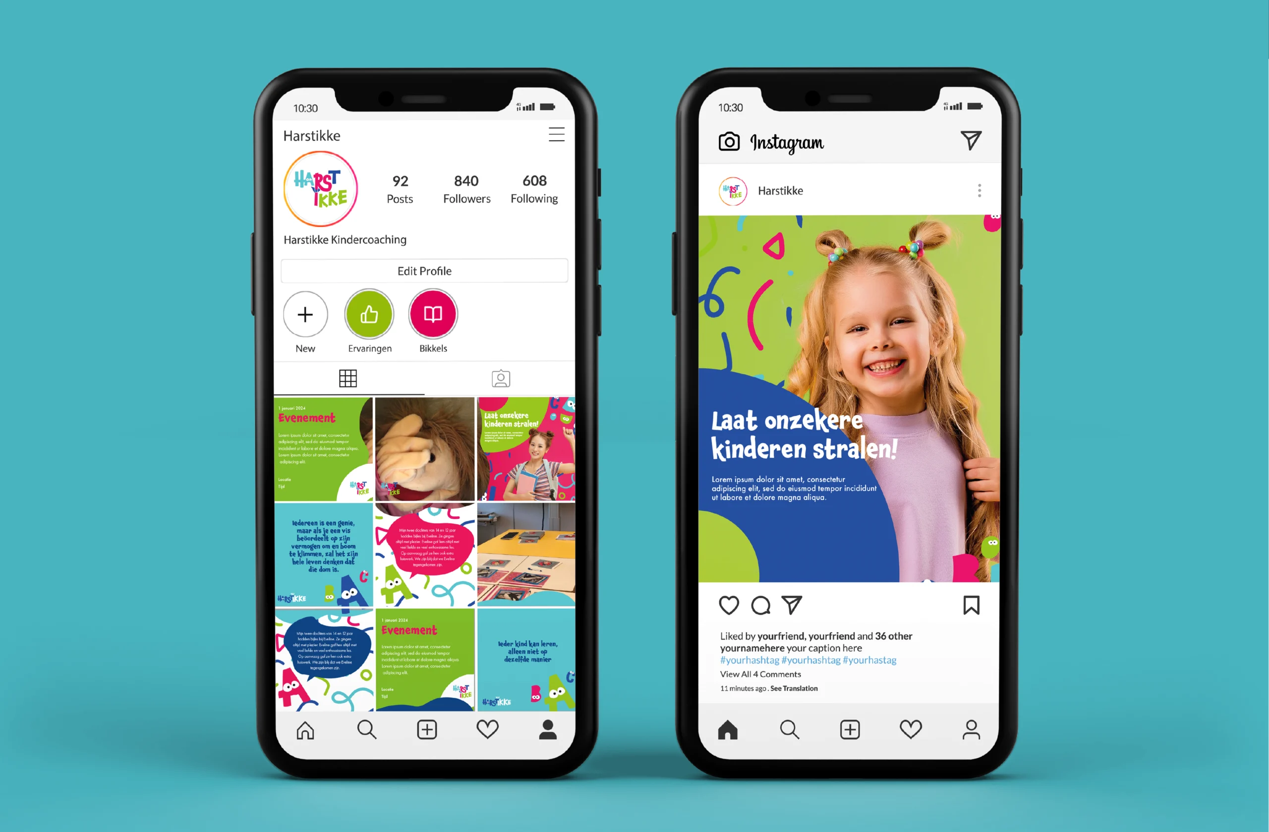
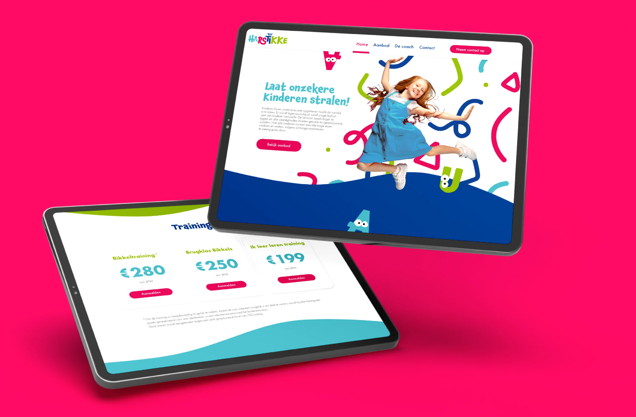
The core keywords for this project are playful, growth, and unique. These values inspired the visual concept: bringing to life small, friendly monsters based on the alphabet and numbers. Each monster represents a unique character and personality, just as every child is unique. The monsters are not only playful and cheerful but also symbolize the growth children experience throughout their coaching journey.
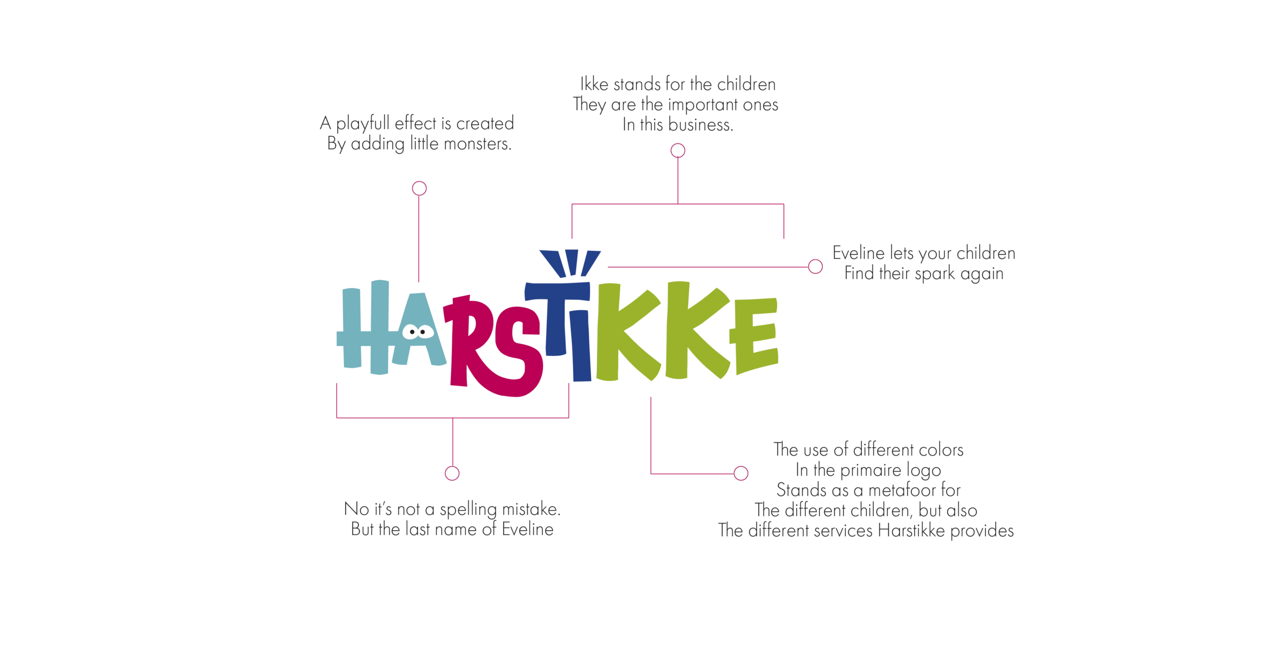
This idea is clearly reflected in the logo. The letter ‘a’ has been transformed into one of the monsters, creating a playful and inviting visual. Additionally, the use of different colors reinforces the concept as a metaphor for diversity: every child is different and has their own color and strength. This refreshed visual concept makes Harstikke Kindercoach recognizable, engaging, and unique, setting the tone for a brand that helps children grow in a safe and playful environment.